Amir Günther · 6 October 2026
Examining Seasonal Traffic Fluctuations Through Data Visualization in Retail Search Performance
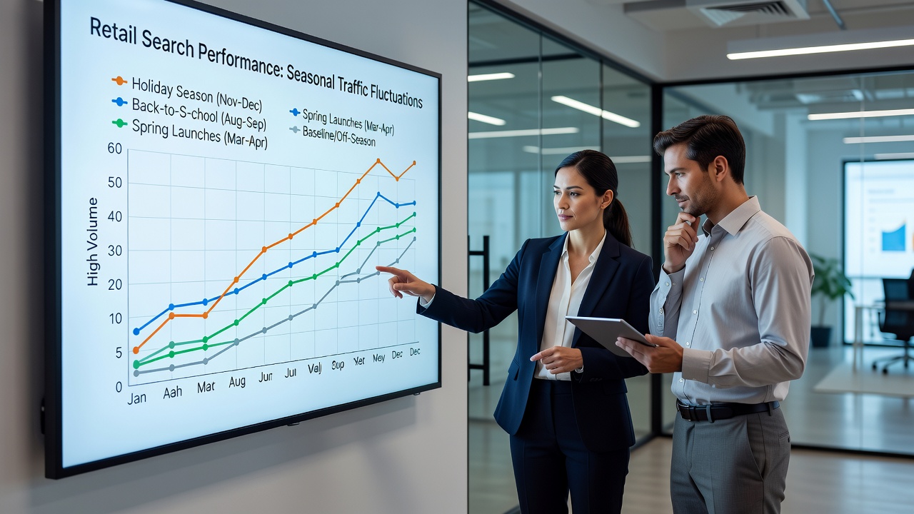
Retail search performance shows clear seasonal shifts driven by consumer behavior cycles, holiday periods, and promotional events, while data visualization turns raw metrics into clear patterns that teams can track over time. Analysts plot organic search volume, click-through rates, and keyword rankings on timelines that stretch across months or years, revealing spikes during back-to-school periods in August and September as well as surges before major shopping events like Black Friday and the December holiday season. These visualizations often combine multiple data layers, including geographic breakdowns and device types, so that observers can compare performance across regions without losing sight of overall trends.
Core Elements of Seasonal Data in Retail Search
Search engines record consistent increases in retail queries during predictable windows, and visualization platforms map these changes through color-coded calendars or stacked area charts that highlight both peaks and troughs. Data collected through October 2026 already shows early acceleration in categories such as apparel and electronics, with line graphs illustrating how traffic from mobile devices outpaces desktop during evening hours in the weeks leading into holiday promotions. Researchers compile these figures from aggregated analytics platforms and cross-reference them against historical baselines, allowing teams to isolate the effects of external factors like weather events or economic shifts that might alter typical patterns.
Visualization Techniques Applied to Retail Metrics
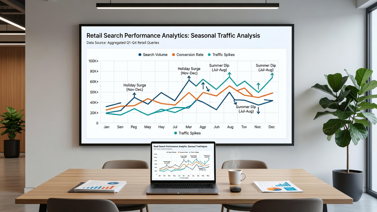
Heatmaps provide one effective method for displaying hourly and daily search fluctuations, while time-series graphs connect consecutive data points to show the speed at which traffic builds toward peak days. Retail analysts frequently overlay search impression share against conversion rates on the same axes, creating dual-axis charts that reveal whether rising visibility translates into actual sales during high-demand periods. Interactive dashboards let users filter by product category or keyword cluster, so that a spike in queries for winter apparel appears distinct from steady demand in home goods throughout the year. These tools draw from structured datasets that include both paid and organic results, giving a fuller picture of how search engines distribute visibility across competing retailers.
Examples from Recent Retail Cycles
One dataset covering North American retailers in late 2025 documented a 47 percent rise in search impressions for gift-related terms between mid-November and mid-December, with the visualization displaying this growth as a steep upward curve that flattened quickly after the new year. Similar patterns emerged in European markets where analysts used bar charts to compare year-over-year performance, noting that mobile search traffic during the same window grew at a faster rate than desktop traffic. Teams examining Australian retail data through 2026 have tracked comparable pre-Christmas increases, using geographic heatmaps to show stronger activity in coastal cities compared with inland regions during the same weeks. These case studies rely on standardized reporting periods so that comparisons remain consistent across different visualization platforms.
Integration with Broader Performance Indicators
Seasonal traffic analysis gains depth when paired with inventory levels and pricing data, and visualization software often merges these streams into unified views that highlight potential mismatches between search demand and stock availability. Retailers track how ranking positions for seasonal keywords shift in the weeks before expected demand rises, then adjust content or site structure based on the visual evidence. Data from government sources such as the U.S. Census Bureau provides additional context on overall retail sales movements that frequently align with search volume changes. Observers also reference reports from Statistics Canada to compare cross-border patterns, noting that certain product categories follow similar seasonal curves despite differences in consumer habits.
Technical Considerations for Accurate Visualization
Accurate seasonal analysis requires consistent data collection intervals and careful handling of outliers, such as sudden traffic drops caused by site outages or algorithm updates. Visualization tools apply smoothing algorithms to clarify underlying trends while preserving the sharp edges that mark promotional events. Teams validate their charts against multiple data sources to reduce the risk of drawing conclusions from incomplete samples, and they document any filtering steps applied before rendering the final graphics. This process ensures that visualizations remain reliable references when planning inventory or marketing calendars for subsequent seasons.
Conclusion
Seasonal traffic fluctuations in retail search performance become easier to interpret when data visualization converts complex datasets into readable formats that support ongoing monitoring. Charts and dashboards compiled through October 2026 continue to demonstrate recurring patterns tied to calendar events, while also exposing variations that arise from regional or device-specific factors. By maintaining consistent visualization practices and cross-referencing external benchmarks, analysts obtain a clearer record of how search demand evolves throughout the year.